1. GETTING STARTED
In order to create and edit Tips, you need to use both Newired Editor and Newired Portal. For the editor to communicate with the portal, you also need to be connected to the internet or some internal server.
Start the Editor via Portal, first selecting the Site which you would like to add Tips to or you can log in from the editor:

After inserting your server and login details, you will be asked to choose which site you would like to work on.
2. CREATING TIPS
To create a new Tip, first select the target website on the portal or editor. If you start from the portal, click on “Open Editor”.

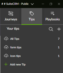
Once the editor is open, you will see three different Tabs on the right hand side of the screen in the Editor sidebar. To create a new Tip, click on the "Tips" tab.
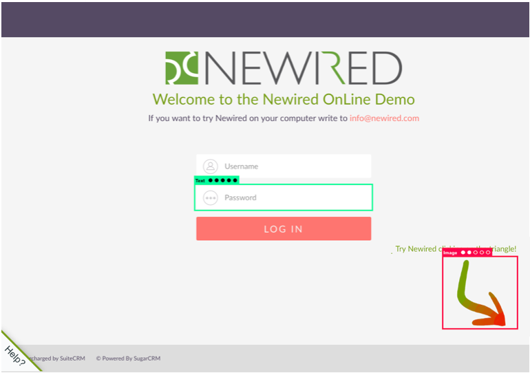
You will see your target website opens on the editor. If you hover the mouse on that area, you will see that it selects whole elements with a green/orange/red square, called selectors (see item 3 below). That is because Tips need to be associated with a given element on a page.

The reliability score of an element changes according to the color and the number of dots shown, which can be from 1 to 5 dots. The more solid dots appear, the more reliable the element. Red stands for a generally low reliability, whereas green means high reliability.
On the screenshot below, you can see two elements which have been scored in the Editor as examples:
If you decide to attach a Tip to a low-scoring element, make sure to test the Tip by performing relevant runtime tests.
On the upper side of the dialog box, you will see a title field. You can edit it to name your Tip. The option comes as “Tip” by default, and will remain like this if you do not change it.

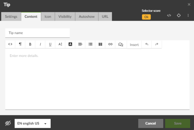
5. CONTENT BOX

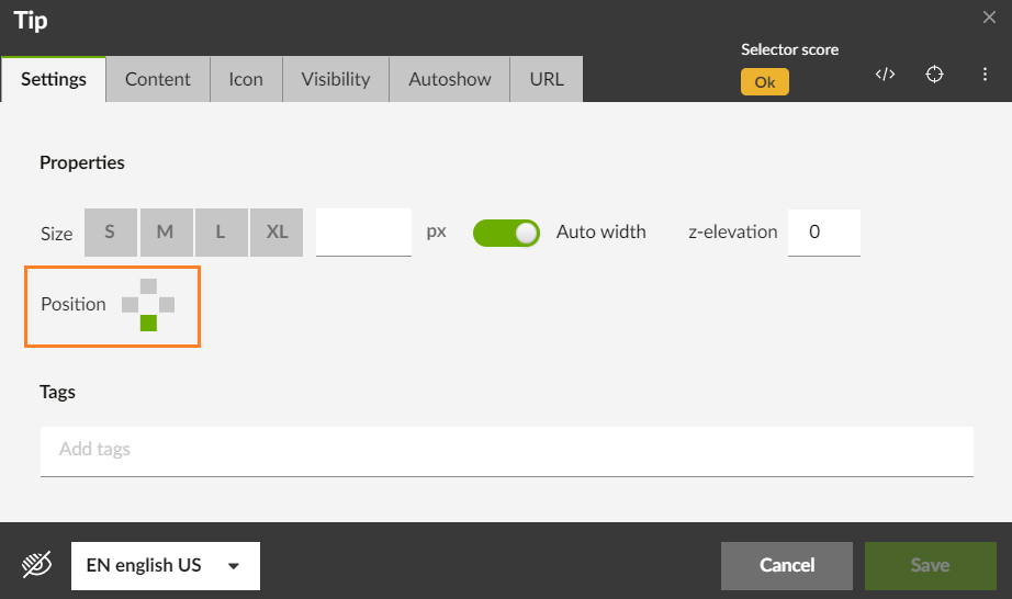
6. POSITION
By clicking on one of the four options, you can choose where the Tip will appear in relation to the element it refers to.
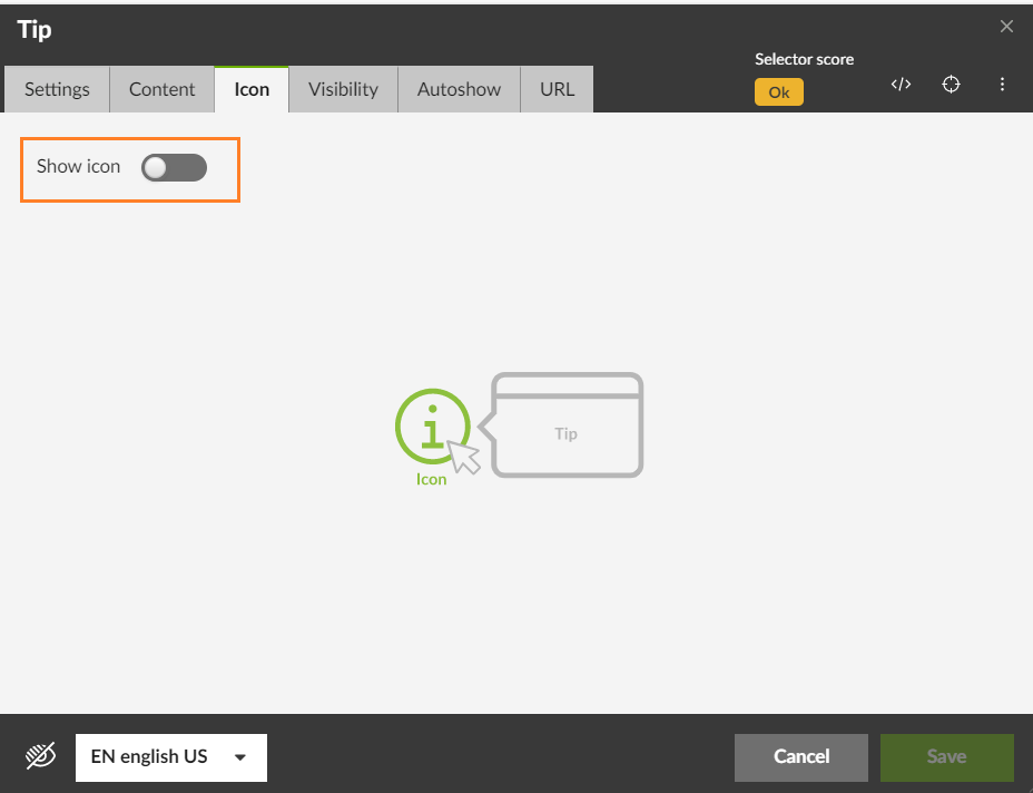
Under the Icon tab, you will see a button called Show icon. You can select or unselect this option when creating a Tip.
You can customize the icon. Check the article "Customizing Tip Icons" for more information.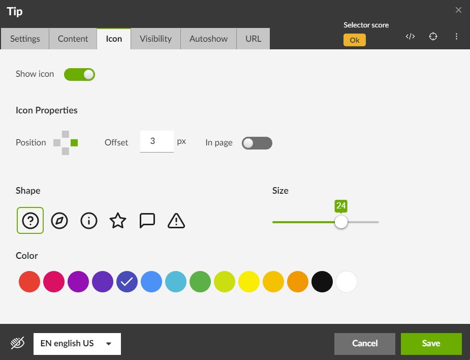
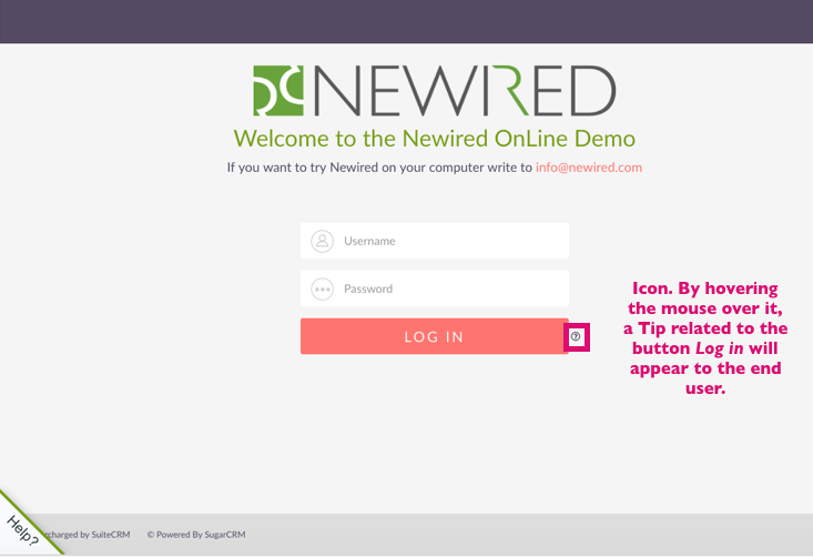
This icon may help attract the user’s attention to that element, making them hover the mouse on that element and read the Tip.
If you leave the option unchecked, the end user will come across the Tip anyway when hovering the mouse around the element the Tip is attached to.
Offset
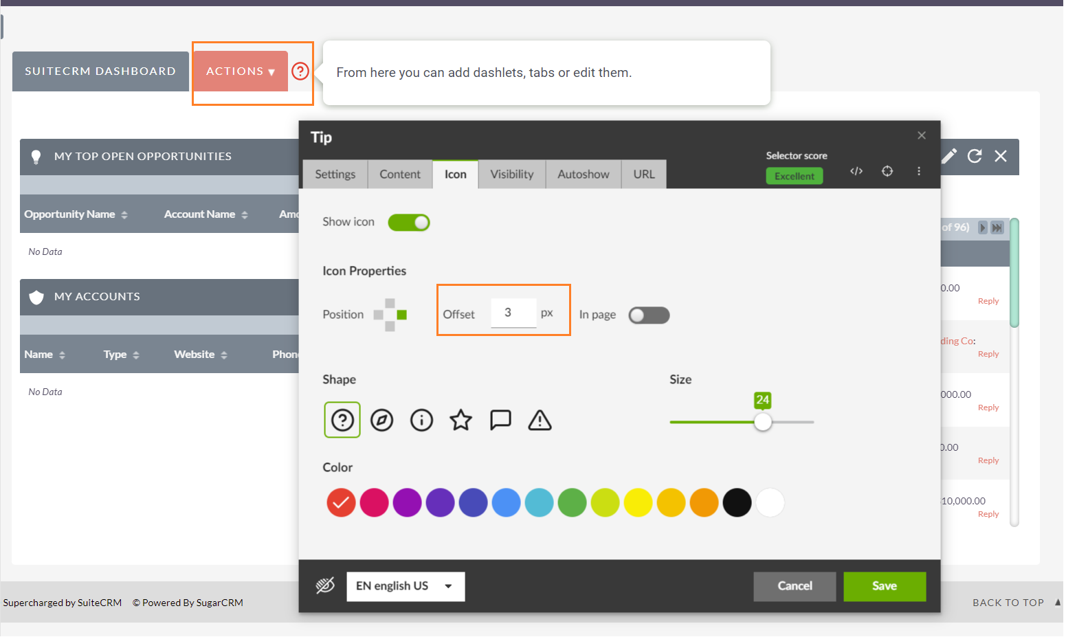
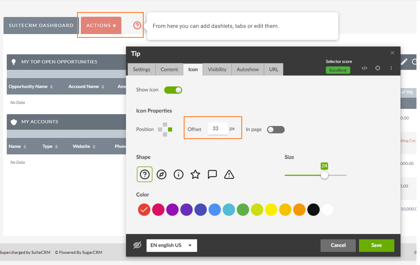
The Offset value can vary from -99 to 99. The higher the value, the further the icon and the Tip will appear from the element they relate to.
From release 19.2, we also have the possibility of defining a negative value for the offset.
The offset can thus be either positive or negative. If positive, it moves the icon in the direction of the established for the anchor (right, left, up, down). If negative, the offset moves to the opposite direction.
In this first case, the Tip icon is anchored to the bottom of the element. The offset is positive and moves the icon downwards:

In the second case, the offset is negative, so the icon is moved downwards (which is the opposite direction of the current anchor):

In Page
If you would like the Tip icon to appear in a centralized default position in relation to the element selected, check this option. Note that checking this option will deactivate the Offset function. By unchecking the “In Page” option and not defining any Offset value, the icon will be placed as an overlay on the same level as the Tip bubble, without interfering with the underlying elements.

8. TIP SIZES
As with Journey steps, you can choose the size of your Tip here:

You can choose pre-defined small, medium, large or extra-large sizes or even personalize the Tip size by writing the size in pixels.
If you select the "Auto width" option to the right, the Tip size will be generated according to the size of the content defined for this Tip.
Was this article helpful?
That’s Great!
Thank you for your feedback
Sorry! We couldn't be helpful
Thank you for your feedback
Feedback sent
We appreciate your effort and will try to fix the article